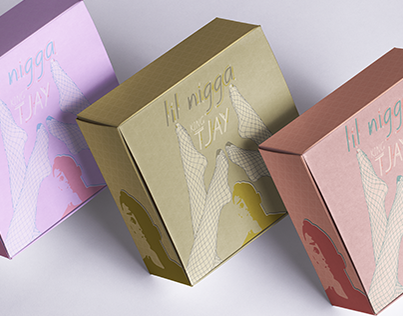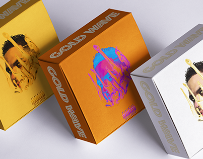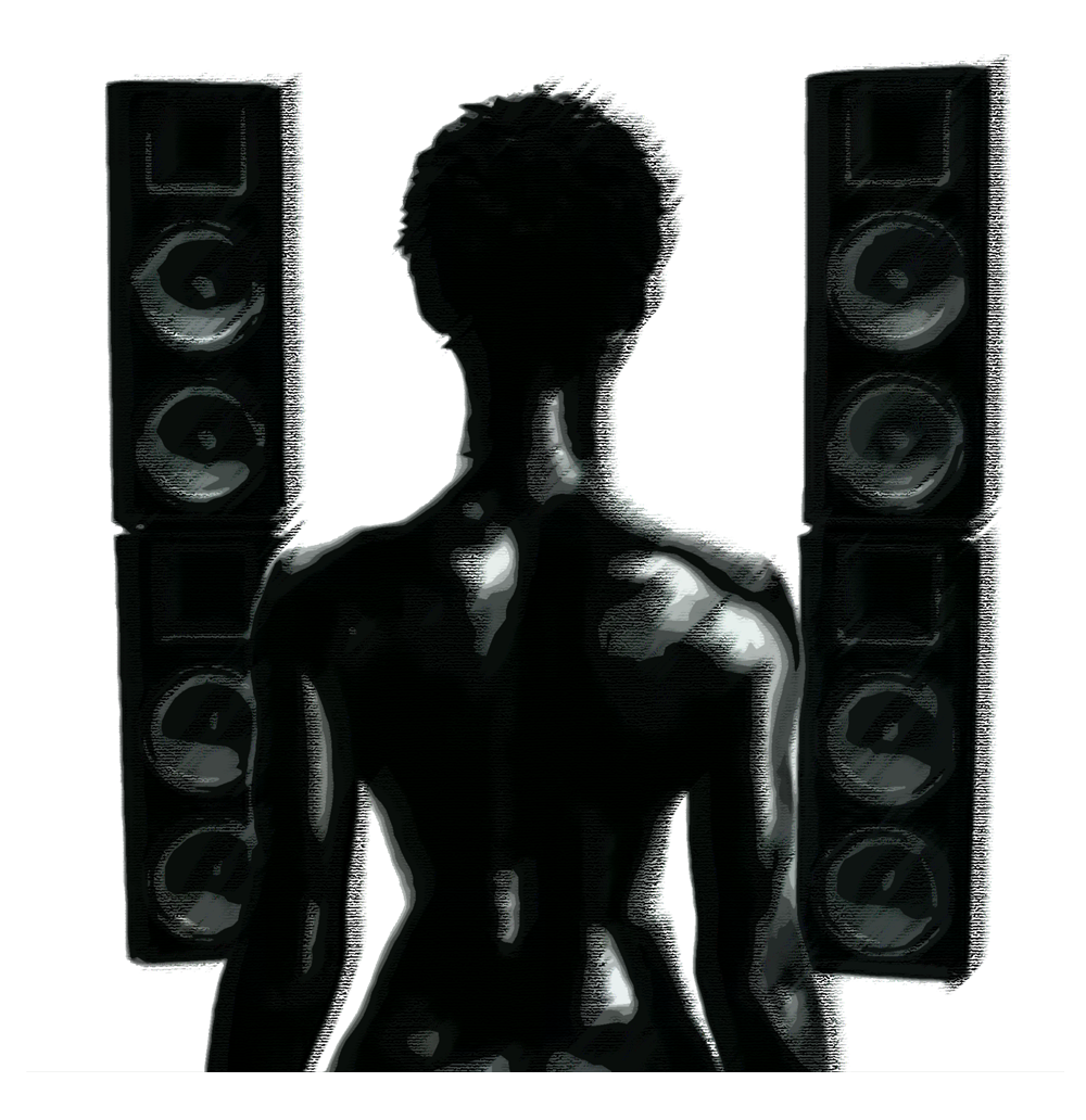
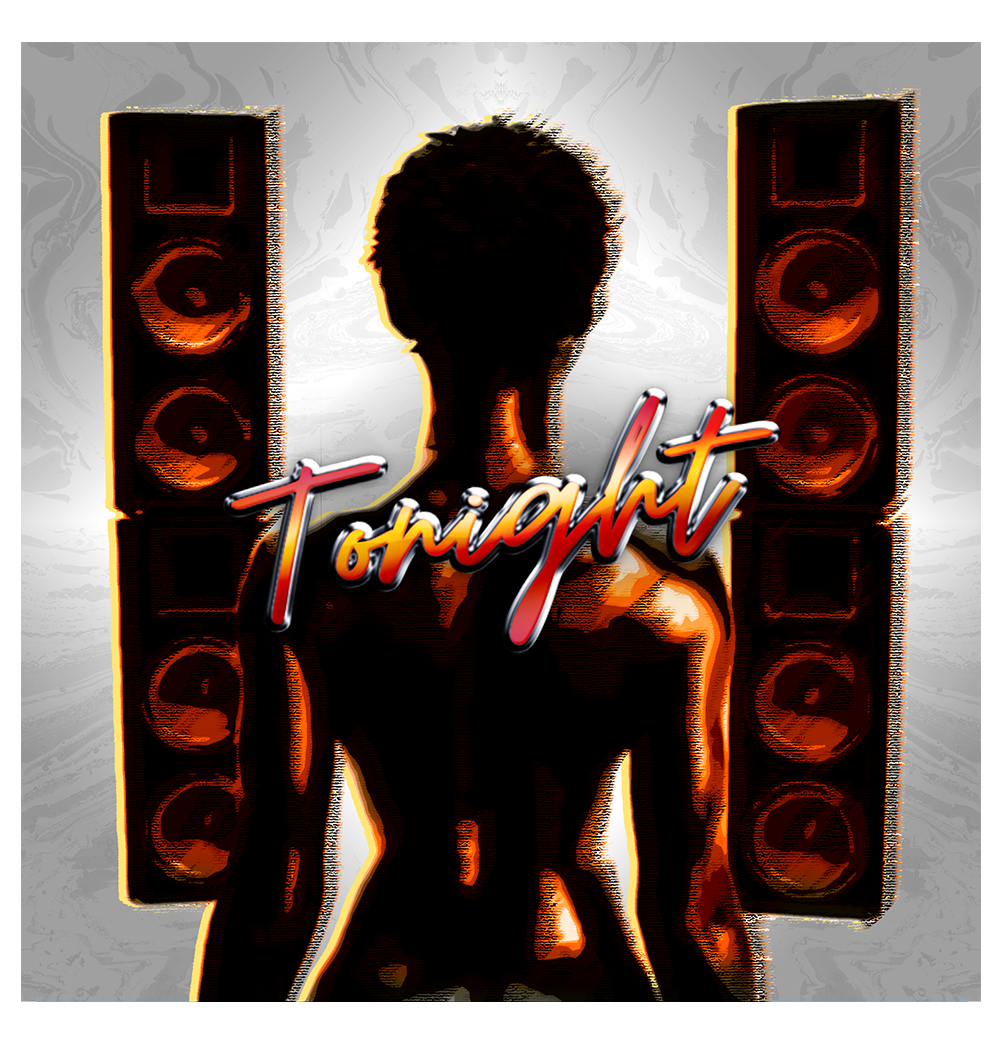
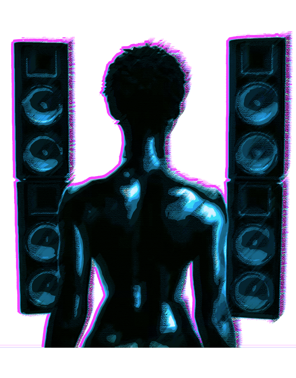


My instructions for this commission was complicated, 'I want it simple but I want it to pop.' Contradicting statements like this can be a nightmare but I accepted it as a challenge. In my client's defense he did provide a reference (last picture.) So I decided to take that concept and make it less dramatic. I took an image from an old music video, edited that screenshot (first picture above) and began to make very subtle manipulations. Nuance and color were my greatest allies for this project. The client wanted orange to be the primary color for the design (second image above.) But after seeing what I can do he decided to go with a color palette from Grand Theft Auto Vice City. I was happy to oblige because I love that color combination.
Earl 'Wolf' Davis