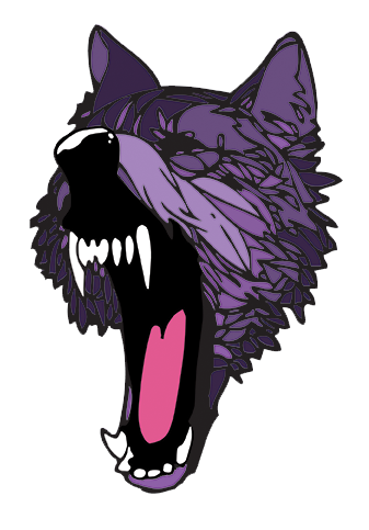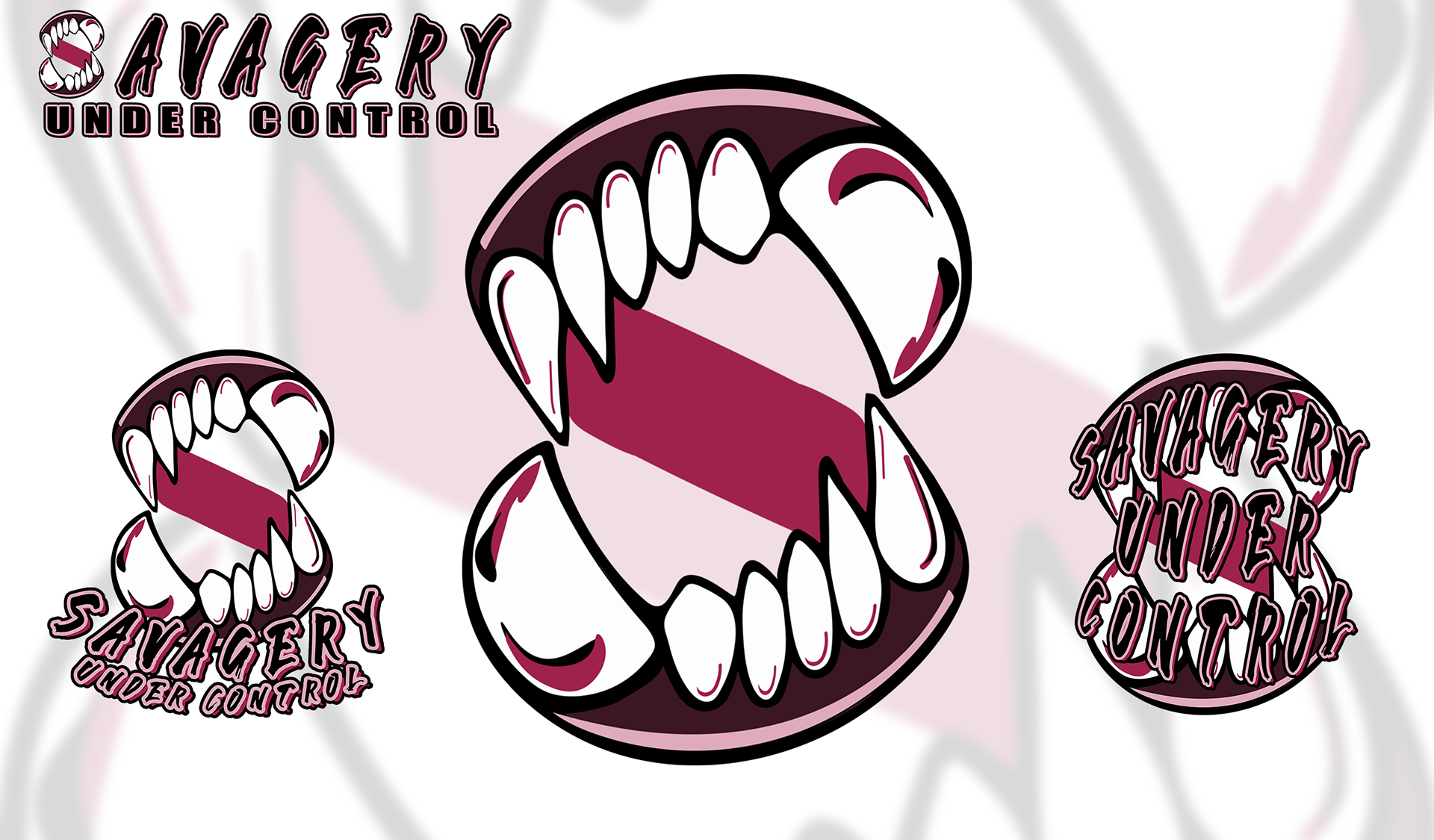
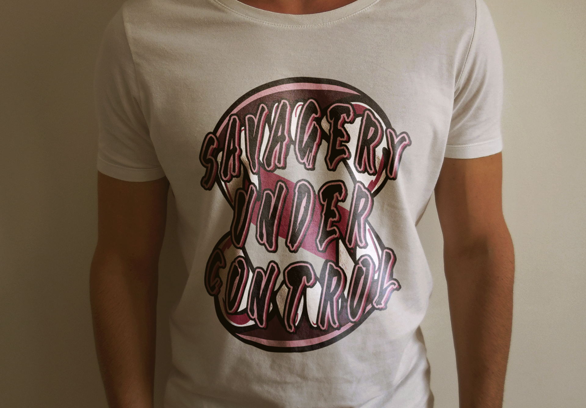

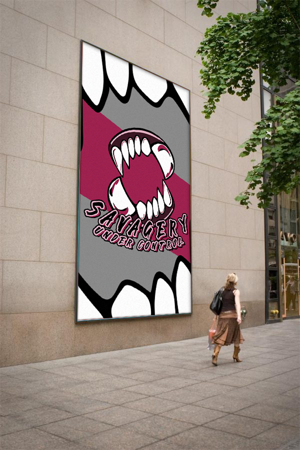
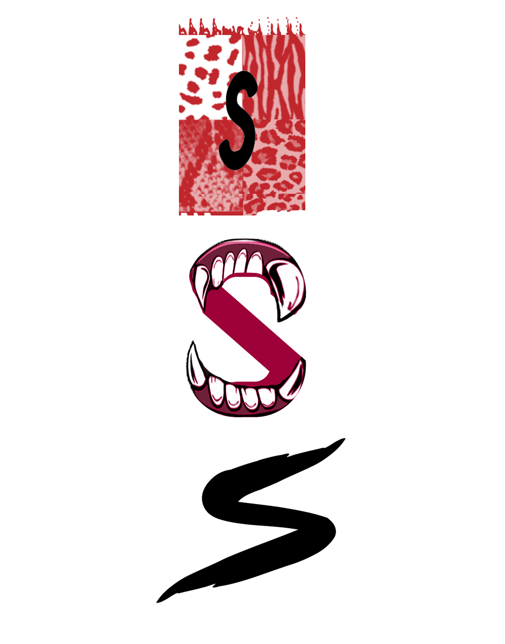
This logo design was another case of the client having a very underdeveloped vision of what they wanted. To combat that and make things easier I decided to design 3 very rough concepts for her to choose from (last photo above.) She chose the 'S' with teeth and it was very easy to develop. At first she wasn't sure about the color scheme but upon seeing the final product she was more than pleased. My goal was to give her something that represented Savagery but wasn't hard on the eyes and too eligible to read. I achieved that.
-Earl 'Wolf' Davis